Pre-order Grant Us Eyes now
We are excited to unveil Grant Us Eyes: The Art of Paradox in Bloodborne, a book-length close reading of Bloodborne by literary critic Nathan Wainstein (LA Review of Books, Cartridge Lit, American Book Review).
Grant Us Eyes situates Bloodborne's oft-discussed difficulty in relation to a much longer tradition of difficult art – surrealist painting, the modernist novel, etc. The book probes the difficulty of Bloodborne's fragmented narrative and of performing close analysis within a medium that still doesn't have established, agreed-upon methods of interpretation in the way literature and film do.
Pre-order today (€65 / ~$73) to get the first edition of Grant Us Eyes when it rolls off the presses early next year. Those who pre-order before November 30th, 2024 will also receive the digital edition of Grant Us Eyes free of charge when it launches (a €15 value).
Pre-order Grant Us Eyes now
A bit more on the book's materials:
- Dimensions: 7" x 10" | 18cm x 26cm
- Page count: 336 pages
- Bound in Italian design paper, over 3mm cover boards
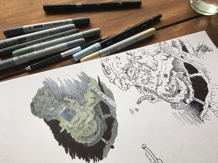
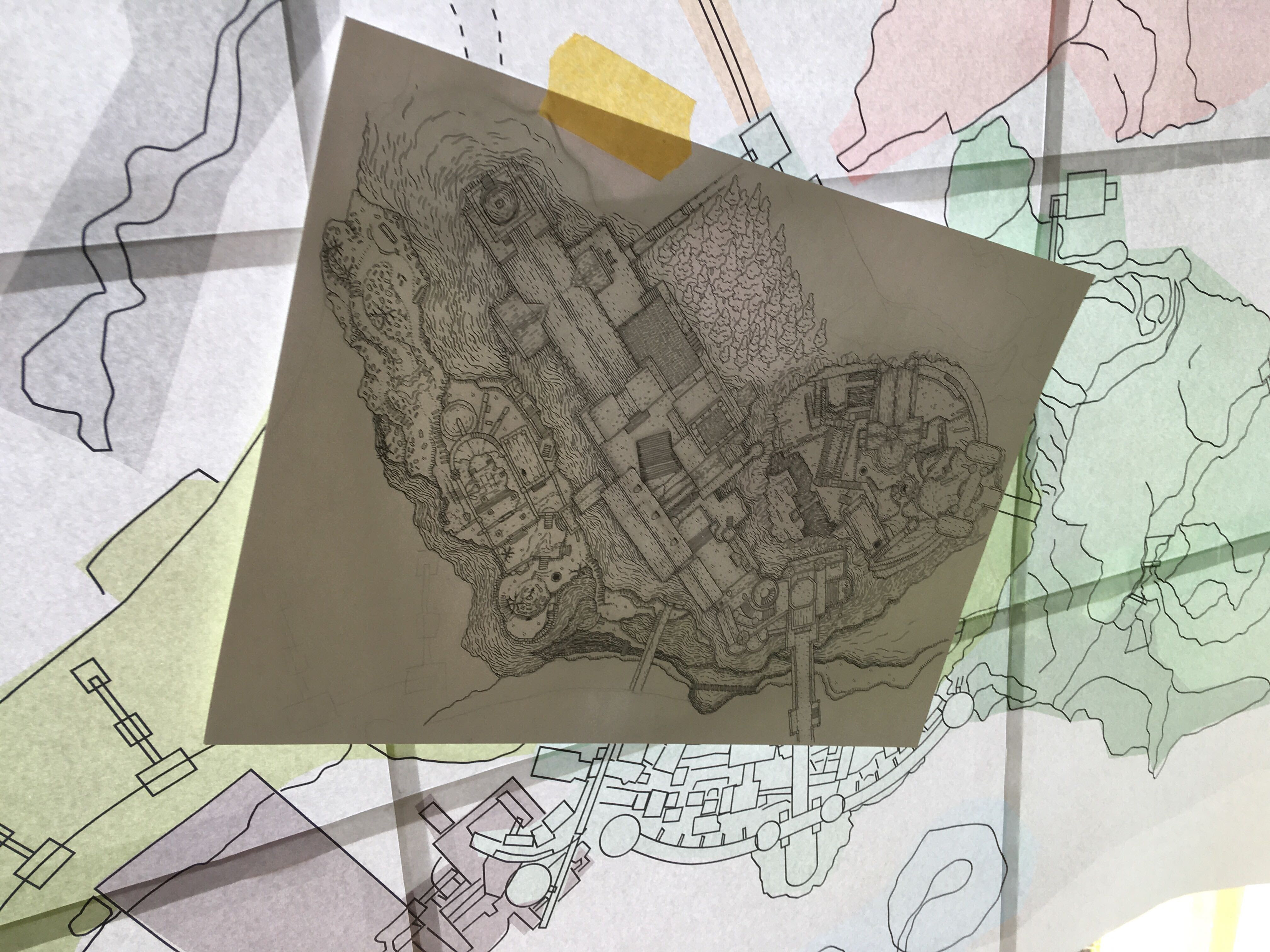
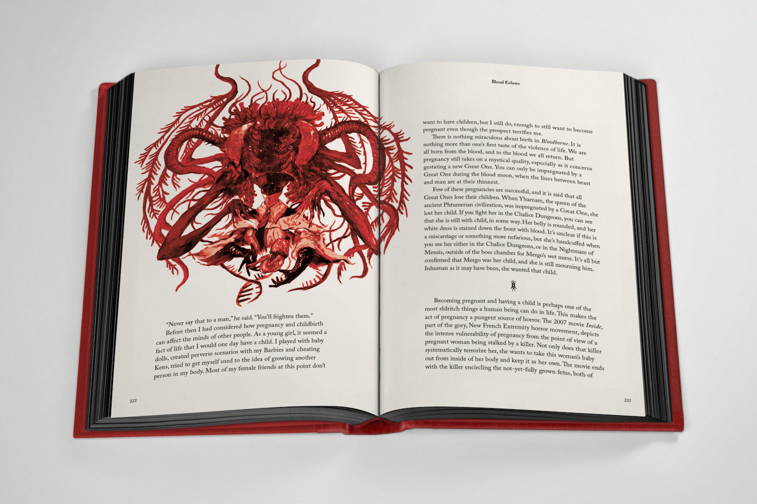
- Cover artwork and 19 internal dropcap illustrations by artist Jaye Shepherd
- Set in Albertan type with Albertus as display
- Printed full-colour, plus metallic-gold Pantone ink on 100gsm Munken Lynx Rough paper stock
- Head-and-tail bands: red
- Red cloth slipcase, blocked in gold foil with Healing Church design by Jaye Shepherd
- Printed endpapers featuring Gothic rood screen
You can also download the free sampler to read the Introduction and one later chapter.
[Note: Grant Us Eyes is not an official Bloodborne product and has not been authorized by FromSoftware or Sony Interactive Entertainment. “Bloodborne” is a trademark of Sony Interactive Entertainment.]
A Q&A With Grant Us Eyes Author Nathan Wainstein
Want to know a bit more about Grant Us Eyes and its "close reading" approach to Bloodborne? Check out this Q&A with author Nathan Wainstein below.
TUNE & FAIRWEATHER: In Grant Us Eyes, you make the case that the disjointed, illogical aspects of Bloodborne's design and story—you use this wonderful phrase, "narrative perversity"—might point to deeper themes in the game. Throughout this book you grapple with the question of whether these themes are intentionally designed into the game by its creators. Having now written the book, do you have a strong feeling on whether its most "perverse" themes were intentional?
NATHAN WAINSTEIN: The question of intention is so interesting. I should say, first, that as a critic I am strongly in favor of speculating about intentionality. In high school or college we’re often taught that intention is irrelevant when interpreting art, but that perspective has a specific historical origin in the development of academic criticism, and doesn’t need to be taken as a given. Actually, even critics who say they don’t care about artistic intention still often attribute intentionality on the sly to the features they analyze—they just call it something else. In my view, it makes complete sense to care about intention, even if it’s fundamentally unknowable, and we should just embrace that. If I read a story where the timeline contradicts itself, of course it matters whether the author intended that or if they just messed up the chronology: to deny this fact seems silly. Just like it matters whether the likeness of a human face on a rock formation (cf. the Nightmare of Mensis) was carved by hand or arose there naturally by chance. One option isn’t inherently better than the other, but they’re different categories of phenomena, and that’s important.
All of which is to say that I’m comfortable suggesting that certain narrative tensions, contradictions, or perversions in Bloodborne are probably intentional while others aren’t—even though such suggestions are by definition provisional. It’s quite possible that I’m wrong, but who cares? We make statements about art all the time that are possibly wrong—in a way, that’s all criticism is. But I will also say that what makes Bloodborne so interesting in this respect is that temporal confusion is already baked, explicitly, into its story, since the Great Ones both defy and distort time. So as a result, even narrative faults that seem to me like oversights or mistakes still gain this weird fittingness.
Something I enjoy about this book is the range of sources you pull from. You're just as likely to quote a German philosopher like Theodor Adorno as you are to pull from comments posted by a Reddit user named BlackHawkRogueNinjaX. Can you talk about the research process for this book, and how deeply did you embed with the existing Bloodborne community?
Yes––I can’t overstate how important Reddit was to the development of this book. As a critic, I value nothing more than precision. If you’re going to say something about a work of art, it should be based on specific features of the artwork that are observable, or even measurable, at the granular level. And the Reddit community for Bloodborne, as for other games, is peerless in its attention to detail. It’s far better at this than a lot of professional gaming criticism and writing, though I think the reasons for that are complex. But I’m continually impressed when reading the subreddit—something I do often for Souls games while I’m playing them—at how exacting and thorough users are when making claims about a game or rebutting other claims. So when formulating my own arguments about Bloodborne I would frequently ask myself: is there some tiny exception to this claim that Reddit users would immediately catch? It helped keep me honest—and I’m sure I’ve missed some things nevertheless.
But beyond this, I also value the Reddit community for the sheer creativity of the interpretations I see on a regular basis. Whenever I was puzzling over some ambiguous or contradictory detail in Bloodborne—so, pretty much with every chapter—I’d often do a Reddit search to see what explanations the Bloodborne community has come up with, and I’ve cited these in the book whenever they’ve informed my thinking. I see criticism as essentially a creative act, so I don’t care if an interpretation is outlandish—that’s by and large a positive for me. If anything, I find that Reddit users sometimes edit themselves or apologize too much when speculating about story details: they maintain a kind of clear-eyed practicality about what’s really plausible in the creation of art that is wholly foreign, for instance, to many academic critics of literature. Seriously, even the most extravagant Reddit theory about some random environmental detail in a Souls game is more reasonable than many of the academic interpretations of novels I read as part of my job.
Given that there are so many games one could play (and films to watch, books to pre-order, and so on), we all struggle with deciding whether any given game or other artistic work is worth our time. What convinced you that Bloodborne is worth not just the time you spent playing it, but the countless hours you spent putting together this book analyzing it?
I think it was a combination of two factors. First, though it almost goes without saying, sheer love of the game itself. To me Bloodborne is special even among the Souls games for reasons I don’t think are articulated enough. It’s not just the atmosphere, or the superb combat, or the novelty of having genuine jump scares in your Souls game (the werewolf near the bottom of Old Yharnam is my favorite). It’s also the beautiful economy of the design. For instance, I talk about this in the book, but I love how virtually every single item feels considered, useful, and—most importantly—unique. I did an Arcane playthrough at one point just to try out every spell, because unlike in Dark Souls or Elden Ring there’s basically no redundancy. Instead of having 30 spells that are slight variations of each other, Bloodborne has only a handful, but each one does something completely singular and, unless I’m mistaken, even has a unique visual effect. This level of intentionality and hand-crafting down to the individual item distinguishes Bloodborne for me not just among Souls games but among blockbuster games in general. The only comparisons I can think of at this scale are Final Fantasy IX and Metal Gear Solid 2.
But I was also drawn to Bloodborne for more abstract reasons. I study modernist literature, and one thing I could not stop thinking about when I first played Bloodborne was the art historian Michael Fried’s suggestion that the modernist artwork (I’m paraphrasing a bit) “turns its back to you.” To me this phrase describes Bloodborne perfectly. It’s not just about the difficulty or obtuseness—though these do play a part—but also a certain taciturnity or reticence that I find incredibly compelling. Bloodborne is like Eileen the Crow when you first meet her, gazing out over the dark city with a kind of inscrutable yet solemn reflectiveness. This image, which I elaborate on in the book, was in many ways the seed of the whole project.
Grant Us Eyes regularly draws from your experience with other games in the Soulsborne series to establish patterns or maybe narrative habits that seem to be embraced by FromSoftware across all of their games—one interesting example is that the worlds often have this deep mythology filled with Gods who aren't totally trustworthy. Are there other throughlines that connect Bloodborne with other games in the series, or even with a game like Elden Ring?
If I can get granular here for a second, I’m fascinated by the way Bloodborne, Dark Souls III, and Elden Ring all have a moment where you seemingly return to the main hub area, a la the famous looping paths back to Firelink Shrine in Dark Souls, only to realize that the area is not actually your hub but an eerie double of it. There seems to be so much going on with this trope, both on a purely formal level—in this brilliant motivation of the repeating environmental asset—and on a more conceptual level, involving questions of déjà vu and the uncanny. (Sigmund Freud’s essay “The Uncanny” actually turns on a similar experience of spatial looping and/or repetition.)
I discuss Bloodborne’s version of this moment at length in the book. But one thing I find striking is the way Elden Ring expands on this device of the “fake return,” as I like to call it. In Elden Ring you don’t just have the fake-out return to the Roundtable Hold (which works much like it does in Bloodborne: you again find the real-world original of your otherworldly hub), but also two dungeons, the Leyndell Catacombs and the Giant’s Mountaintop Catacombs, where the same principle becomes an operative part of level design. These catacombs memorably play a trick where you repeatedly traverse areas that look like rooms you’ve already cleared but are in fact copies of those rooms. So, though I feel that Bloodborne generally gives the purest and most radical version of a lot of Souls tropes, this is one case where Elden Ring takes a device that was already unsettling and makes it even more perverse.
In the book, you are quite frank in describing aspects of Bloodborne that you feel are illogical or imperfectly realised. Yet you also laud the game as a ‘masterpiece.’ How do you reconcile this paradox and tension in your assessment of the game’s artistic merit?
I guess I just think that masterpieces are allowed to have faults! A video game, like a novel, is an enormously complex system, and there is just so much room for error at every single scale, on every structural axis. The literary critic Erica McAlpine argues in her recent book The Poet’s Mistake that recognizing mistakes in the work of great writers only helps us appreciate their actual achievements more, since it allows us to perceive how difficult the work of writing really is. In Grant Us Eyes I take a similar perspective on Bloodborne.